Branding - Cautionary Tail
Cautionary Tail Studios
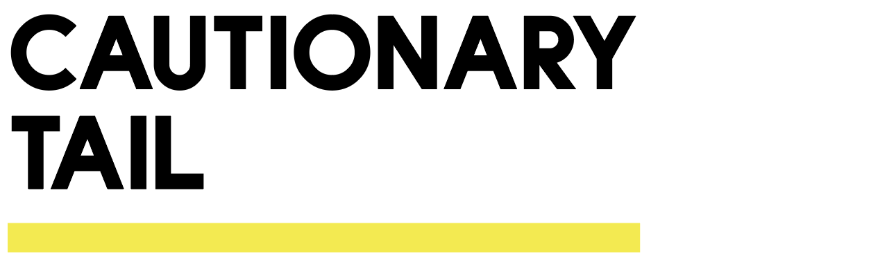
BRAND IDENTITY - LOGO
This design was commissioned by an up-and-coming music studio requesting a logo for his record label, Cautionary Tail. They were massive lovers of all things related to mixing and traditional music engineering - particularly the hardware and symbols used behind the scenes by the music producer. With that, the overall need was to incorporate an aspect of antique recording equipment they collect and work with. VU meters stood out prominently in our minds.
The name of the record label is placed across a stylized VU meter, a familiar visual assisted by the appearance of a red needle symbolically reading inside of the red (or cautionary) section of the meter and the mechanical accent of two screws on each side.
I created this logo as the sole designer in Adobe Illustrator and animated it in Adobe After Effects.
PROCESS
We sat down through a series of brainstorming sessions to hone in on the desired look and feel, outlining in visual detail the emotions, the color palate, and the symbolism that represented the studio’s values and name.
The use of formal mock-ups, professionally drawn up and presented for the client to review each proposed variation helped to ensure that we could leave no stone unturned as we evaluated options and selected the final version of the logo.